Tom Walsh, President of the Art Directors Guild and I had the pleasure of being interviewed by
Susan Stamberg of NPR's Morning Edition this past week. The show focused on Designs on Film: A Century of Hollywood Art Direction and the NPR website did a wonderful accompanying piece on their website "Long Before Computers, How Movies Made Us Believe."
I love film art and thought you would enjoy a few renderings from the book. Above is production designer John De Cuir Sr.'s barge design for Cleopatra and below is the centerpiece set for Dr. Zhivago, the ice palace. Shot on set in Spain (and in the summer no doubt), production designer John Box literally placed wax on everything inside the dacha while a prop man dutifully followed him with a bucket of cold water and splashed the wax. Hence the look of ice cycles and one of the most memorable sets in Hollywood history.
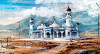
Production designer Stephen Gooson's designs for the lamasery in Lost Horizons -- built and shot on the Columbia studio ranch. The film's version of Shangri La was built to scale in two months and the designers were strongly influenced by Buddhist buildings and the works of Frank Lloyd Wright.
Production designer William Cameron Menzies designed over 2000 sketches for the storyboards for Gone With the Wind. The watercolor of Tara below is by artist Dorothea Holt Redmond. Tara cost $12,000 to build on the Selznick backlot and telephone poles were wrapped to resemble trees. Sorry to spoil the grandeur of Tara.
Chinatown restaurant scene with Jack Nicholson and Faye Dunaway above and continuity sketch below. The period film was designed by Richard Sylbert.
If you are in the Los Angeles area this week, I will be signing books on Thursday, February 3rd at Barnes and Noble, 1800 Crans Avenue in Manhattan Beach from 11-3 PM and Book Soup on Friday, February 4th at 7:00 PM in West Hollywood. I will also be speaking at the Beverly Hills Women's Club with a book signing to follow on Thursday evening at 6:30. For more information see their website here.
Whew!
Photo Credits: Columbia Pictures, Paramount, MGM, Twentieth Century Fox, Art Directors Guild


Those sketches are amazing! I love the tidbit on Gone With the Wind. It's one of my favorite movies.
ReplyDeleteIf you are in Atlanta this April, I am speaking at the Atlanta HIstorical Society on the making of Gone with the Wind.
ReplyDeleteI heard the NPR interview. It was great! I loved the story about the Ice Palace.
ReplyDeleteWhat fabulous renderings, works of art themselves!
ReplyDeleteJohn De Cuir Sr. was an amazing artist, but was also a technician. He could draw lens distortion into his perspective work as well. He had the uncanny ability to draw a giant rendering as a mosaic on 8.5 by 11 sheets, number and fax them, and when reconstructed on a wall elsewhere they held together as a mural, seamlessly holding their perspective from page to page. Remarkable. De Cuir gets mocked for being "over the top" with his design, but to me his work added a richness that made each picture. Who wants Cleopatra restrained?
ReplyDeletePrograms like "sketchup" do speed up the process, but something is lost when hand drawing someday becomes a luxury. We have this legacy to inspire us.
Thank you for your comment and could have not said it any better. I am a huge fan of DeCuir and his work is legendary.
ReplyDeleteWhat a shame the incredible contributions of the production design of Pixar films weren't included in this discussion. Richard Sylbert thought VERY highly of the work being done at Pixar--and even said in the introduction of his book that if his mentor, William Cameron Menzies, was still around, he'd be working at a place like that.
ReplyDeleteIn fact, there is enough great work from Pixar films to have their own post, I don't think the exclusion was conscious, it's pretty hard for Cathy to include everything.
ReplyDeleteFor those interested, more on John De Cuir here.
http://www.cinematix.us/decuirbio.htm
It was a question of licensing costs as well !
ReplyDeleteI would love to see you do a whole essay on WC Menzies and his "vertical style" of architecture. the optimism and romance of stretching the scenery in a vertical way was something he did beautifully in the Fairbanks pictures and I'm sure had a big effect on design.
ReplyDeleteA new book well worth owning.. FYI
ReplyDeleteJust got my copy yesterday and it is truly the best work on the subject. A great companion for Design on Film. Any designer will love seeing the backlot streets in the MGM Golden Age.
http://www.mgmbacklot.info/
De Cuir also worked well in Spain and I have been fortunate to meet some of the art directors who worked with him, like Gil Parrondo and Wolfgang Burmann. I wrote about it in my books "Directores artísticos del cine español" y "La arquitectura de los sueños: Entrevistas con directores artísticos del cine español". Thanks for your great blog and congratulations.
ReplyDeleteJorge Gorostiza
www.cinearquitecturaciudad.blogspot.com
Jorge,
ReplyDeleteThank you so much for your post and I would love to see your book - is it on Amazon?
Cathy
Cathy, my books are on Amazon http://www.amazon.com/s/ref=nb_sb_noss?url=search-alias%3Dstripbooks&field-keywords=jorge+gorostiza&x=15&y=21
ReplyDeleteI'm far away in the Canary Islands, but I can try to mail my book, if you send me your mail to my email jgorostiza@arquired.es
Thanks.