Thursday, April 30, 2009

It Started with a Portrait: Laura


Laura (1944) is the  story of a New York City police detective's  (Dana Andrews) obsession with a murder investigation of a young woman named, you guessed it, Laura. Directed by Otto Preminger, the film noir has brilliant one liners, a haunting soundtrack and great sets. And the design all starts with a portrait.


Art Directors Leland Fuller and  Lyle Wheeler (Gone With the Wind) and Set Decorators Thomas Little and Paul Fox received an Academy Award nomination for the film. Little and Fox were literally the Parish/Hadley of film decor at that time. Little worked on an astonishing four hundred plus films (Snows of Kilimanjaro and All About Eve were some of the best) and Fox survived Cleopatra (I will write a future blog on the making of that film. It's a great behind the scenes story.) and Desk Set. Between the two of them, they had nine Oscars for their work.

The antique and Aubusson  filled sets are stylish, elegant and reminiscent of cosmopolitan Manhattan interiors of the forties.

The painting was an actual photograph painted over with oil and reused for On the Riviera and Woman's World. 


Acid tongued critic Waldo Lydecker's luxurious bathroom. Played by Clifton Webb, he utters one of the film's more memorable quotes "I don't use a pen. I write with a goose quill dipped in venom."


Wide angle view of sets on the studio soundstage


Photo Credits: Margaret Herrick Library, Twentieth Century Fox

Wednesday, April 29, 2009

The Interior Designer on the Silver Screen


 They have been portrayed as predatory cougars, virginal ingenues peddling antiques until they find Mr. Right and pushy social climbers. Hollywood pays little attention to the profession of interior designer. And they don't fare any better on television either -- Grace is neurotic and  food obsessed while Designing Women gave us four ditzy southern socialites.

Here are a few of my favorite portrayals...

Patricia Neal as the first "Mrs. Robinson" turned designer in Breakfast at Tiffany's (1961)....


And everyone's favorite...Doris Day as Jan Morrow in Pillow Talk (1959). I love how she had the apartment with  Manhattan skyline view and full time maid on a designer's salary.


And her ubiquitous French boss, Pierot...


Darryl Hannah as Darien Taylor, an Upper East Side designer who wants to take antiques mass market in Wall Street (1987)...


Diane Keaton as a textile designer married to a philandering architect (Warren Beatty) in the little viewed film Town and Country (2001)...


Julie Kavner as the decorator pushing an obscure basket vase in Alice (1990)...


Everyone's favorite designer Grace Adler who makes interior design fun in Will and Grace...

And last but not least....the Designing Women of Sugarbakers Design House. Did these women ever work?


Photo credits: Paramount Pictures, Universal Pictures,  Twentieth Century Fox, MGM, NBC/Universal Television, Columbia Pictures Television, New Line Pictures

Sunday, April 26, 2009

Sex and the City in Fashionable Perpetuity


It seems that Sex and the City is a permanent part of our natural landscape with daily television reruns and now multiple showings of the movie on cable. So for those of you who can't get enough of Carrie, Charlotte, Samantha and Miranda's world, here's a revisit to a few behind the scenes look at their interiors.

Designed by production designer Jeremy Conway (who was also responsible for the sets for the television show) and set decorator Lydia Marks (who gave us  The Devil Wears Prada), the interiors played an important role as each character's address was as different as their signature style.   Sharing the screen with the four main characters is the inimitable cosmopolitan backdrop of Manhattan with the apartments recreated on a sound stage in Long Island City’s Silvercup Studios. As Sarah Jessica Parker notes, “New York became the fifth woman. She really became this critical character, integral to the story.” 


Carrie Bradshaw's  Iconic Apartment before....


and after.....

Carrie's interior was painstakingly recreated down to the last detail; even her desk, which had been donated to the Smithsonian Museum, was borrowed back for the film. Since there is a time lapse of several years, the furnishings went through an update as Marks explains, “Since Carrie is so involved in fashion, I thought it would be very believable she would have new fabrics around her so the curtains, upholstery and bed linens are all new for the film.” Decorated with dramatic blue walls, floral settees and mirrored tables, Marks even incorporated Carrie’s passion for couture with the draperies made of fabric similar to “a great sculptural wedding dress.”


While the women are no doubt influenced by the latest trends, Conway and Marks looked to a stylesetter from the past for the Vogue offices of Carrie’s fierce editor, Enid Frick (Candice Bergen). Interior designer Dorothy Draper, known for her “Modern Baroque” designs in the early twentieth century, provided direction for the design duo (as evidenced by the black lacquered credenzas). “Her designs managed to be about both glamour and good taste while being functional spaces.”

Enid Frick's  (Candice Bergen) office at Vogue


Charlotte York Goldenblatt's Park Avenue Apartment redecorated

Charlotte’s elegant Park Avenue pad retained the original clean and neutral toned palette as Marks notes, “She is still in her ivory tower, but the overall feel is very eclectic. The gorgeous chaise in her bedroom is an antique found at New York’s Newel Galleries and she can feel like Cleopatra while reading a novel on it.”


Lily's bedroom

The pair also designed a sophisticated yet whimsical nursery for daughter Lily, featuring a toile bed mixed in with mid-century modern toys and furniture from Vitra. “As a decorator, I don’t often get the opportunity to mix toile and mid-century modern!” exclaims Marks.


Writers are hard at work on the script for Sex and The City Part Two. Rumors abound -- Chris Noth a.k.a. "Mr. Big" has not signed on yet, plot lines have already been leaked, etc. No doubt there will be lots of sex, drama, shopping, cocktails....and the inevitable product placements. 

Photo Credits: Courtesy of New Line Cinema


Thursday, April 23, 2009

Set Decor: One of the Best Magazines You're Probably Not Reading


One of the best magazines you are probably not reading is Set Decor. Why? Because you probably don't know about it.

Set Decor is the official magazine of the Set Decorators Society of America, a non-profit organization for the profession whose work graces film, television, commercials and even music videos. 

I discovered the magazine several years ago when I started research on my book and haven't missed an issue since. Not only is it an excellent visual resource but has a great back story on the film and shows it profiles. Published seasonally, mere mortals not in in the business can subscribe. For more details, see the organization's website www.setdecorators.org.

And in these uncertain times for shelter magazines, it's great to find something new.

Photo Credits: Heroes/NBC Universal Television/Set Decor

Friday, April 17, 2009

The Art of Film: Renderings from the Cinema


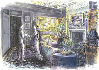
Before the advent of computer graphics,  movie sets were often created by beautifully rendered illustrations. From water color images to pen and ink sketches, these works of art were the template for some of the most memorable interiors seen on the silver screen. 


William Cameron Menzies

Many production designers and art directors of Hollywood's Golden Age were talented draftsmen and artists, drawing on their ability to sketch artists to set the visual scene for a film. Such was the case of William Cameron Menzies, the prolific production designer of the film Gone With the Wind (1939) who prepared over two thousand watercolor sketches detailing the interiors, placement of the actors and scenery. From the burning of Atlanta to the landscape of Tara, Menzies was involved in every frame. (He even directed the Atlanta hospital scene and came up with Scarlett's famed line "As God is my witness, I'll never be hungry again.")

HIs attention to color, scope and detail is legendary. The parlor of Belle Watling (as shown above) was designed in lush red velvet, clearly considered the appropriate color for women of the night at that time. The interior for Atlanta's leading madam even featured a nude portrait which somehow got past the censors.

The interiors for Twelve Oaks were understated, pristine and formal....


The entry hall and library of Twelve Oaks

while Scarlett and Rhett's Tara was heavily ornamented and over the top, representing the prosperity of the New South.

Scarlett and Rhett's remodeled Tara


Famed production designer John De Cuir Sr. was known as Hollywood's Da Vinci as well as one of the greatest film artists (draftsmen, illustrator and painter) in history. The Academy Award winner designed the mammoth production of Cleopatra (1963) along with The King and I (1956) and South Pacific (1958) in his illustrious career that spanned four decades.


The King and I

South Pacific


Cleopatra


Oscar winning production designer Dante Ferretti studied fine arts and has a degree in architecture which shows in his work on the lavishly designed period film The Age of Innocence (1993). Steeped in period correct Victorian interiors, Ferretti and his team spent two years on research alone. Shown below are the sets for Mrs. Mingott and Newland Archer and the Troy opera house.


The Age of Innocence 

Production designer Luciana Arrighi is another talented artist responsible for the design of Merchant Ivory films such as Howards End (1992) and Remains of the Day (1993). Howards End required creating a sunny Edwardian style countryside cottage while Remains featured dark and repressive interiors to reflect the plight of unrequited love between the British butler (Anthony Hopkins) and housekeeper Miss Kensington (Emma Thompson). 


Howards End


Remains of the Day


Photo Credits: Courtesy of MGM, Dante Ferretti, Luciana Arrighi, On the Road to Tara (Abrams), John De Cuir Jr. 

Wednesday, April 8, 2009

The Fountainhead Style


"There is no room for originality in architecture."
--Howard Roarke

It is rare a best selling novel translates successfully onto the silver screen. (Gone with the Wind, yes. Bonfire of the Vanities, no). And often it's a toss-up.


Such was the case of novelist Ayn Rand's critically reviewed yet immensely successful book The Fountainhead (1943), the story of maverick architect Howard Roarke who some say is loosely based on Frank Lloyd Wright. Roarke battles the staid architectural establishment against mediocrity, refusing to compromise his ideals and most particularly, his designs. As the lone proponent of modernism, Roarke's style was said to be modeled after Wright's work of the thirties and forties (take a look at his renowned work on Fallingwater)  and the International Style. It was a time where European modernism met forties corporate American modernism.


Six years later, Warner Brothers turned The Fountainhead (1949) into a film, casting leading man Gary Cooper as Roarke and Patricia Neal as love interest/architecture critic Dominique Fanchon. Much like the book, the film is a cult classic yet met outcry with both movie critics and the architectural community alike. (Perhaps architects hated the devoid-of-soul portrayal of their profession). The film has camp, melodrama, romance, manipulation and yes, great sets. 

Naturally architecture plays a dominant role and the sets needed to be of major importance. As film lore goes, Warners approached Wright to design the film but quickly balked at his
$250.000 fee, hiring a young set decorator Edward Carerre instead. It was his first solo effort on a film.


Through the use of miniature skyscrapers, matte paintings and soundstage sets, Carerre designed prewar modernist apartments complete with spectacular views of the city, sweeping terraces, Alvar Aalto/Scandinavian style modular furniture, seemingly unsupported cantilevered  staircases and reflective tabletops, floors and glass everywhere. He was also heavily influenced by German Expressionism. 


Carerre's design is characterized by themes of shapes - hexagonal grids, rectangular rug with woven pattern of squares in an orthogonal room with a sofa placed on the diagonal. 


Film historians note the sets represent the "last gasp of modernism of the times." Ironically, the very elements the architectural press disputed (such as the contemporary designs of the Enright House) became popular years later in Manhattan.


Wright's famous Fallingwater house became the inspiration (or copy if you will) for the house of the Hearst-like character Gail Wynand.
 

Symbolism abounds in the film -- from the phallic shapes of the skyscrapers to Cooper's jackhammering and chiseling ... well you get the picture. The sexual chemistry made the film that much campier. Legend has it Barbara Stanwyck wanted the role, Ayn Rand wanted Greta Garbo and Humphrey Bogart was considered for Roarke. Imagine what a different film it would have been.


A sultry Patricia Neal graces the cover for my story on classic movie inspiration for Array Magazine (Winter 2004/5). Amazingly she was only 22 years old when the film was made and a relative unknown. Cooper was 47.


Rumor has it Atlas Shrugged may be turned into a movie for release in 2011. Imagine adapting that book to the screen!

Photo credits: Courtesy of Warner Brothers, Array Magazine